Living Room Paint Ideas: Colors That Actually Work on Real Walls
Paint is the single cheapest way to completely change how a room feels. A gallon runs $30–70 and a living room takes 2–3 gallons. That's under $200 in materials for a transformation that looks like you spent thousands. The problem? Paint swatches lie. A 2-inch square on a white card tells you almost nothing about how that color will look on all four walls under your specific lighting. That's why most people end up repainting at least once, wasting $150–300 and a full weekend. Here are the living room paint ideas actually working in 2026, plus how to preview them on your walls before buying.
The 2026 Color Palette (What's In and What's Out)
Cool grays had a 10-year run and they're finally fading. Stark white is going with them — it reads clinical and cold in most living rooms. What's replacing them is warmer, earthier, and a lot more livable.
OUT in 2026: Cool grays. Stark white. Icy blues. Colors that make a room feel like a dentist's office.
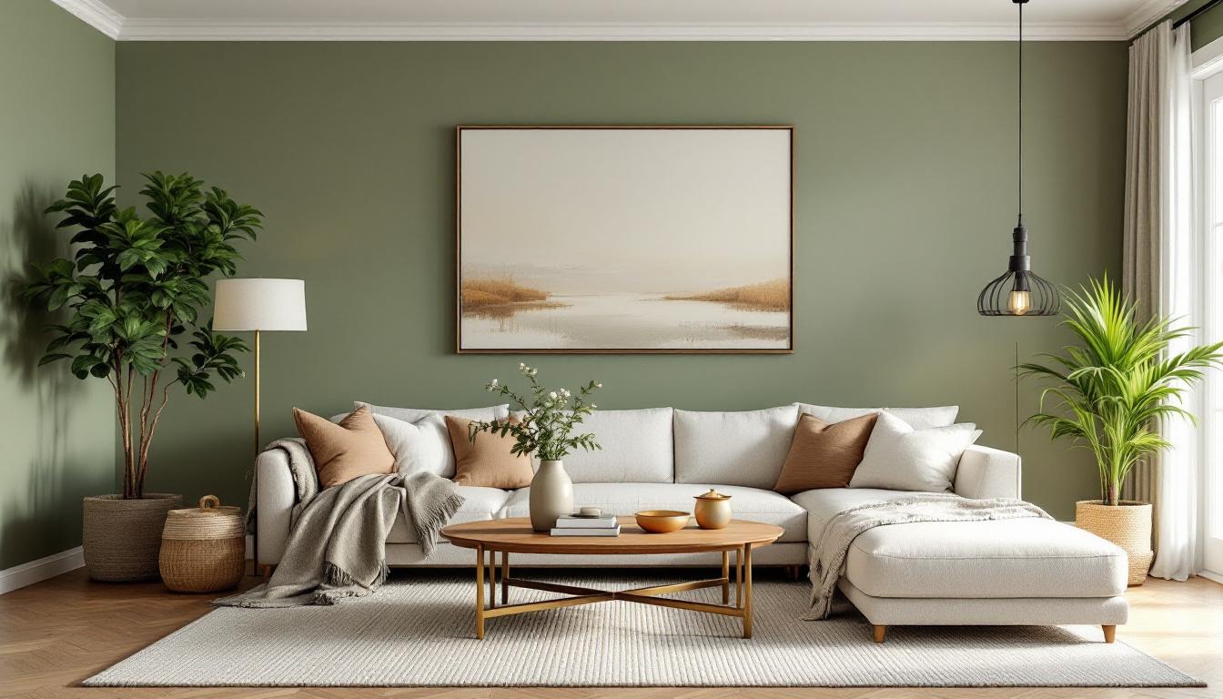
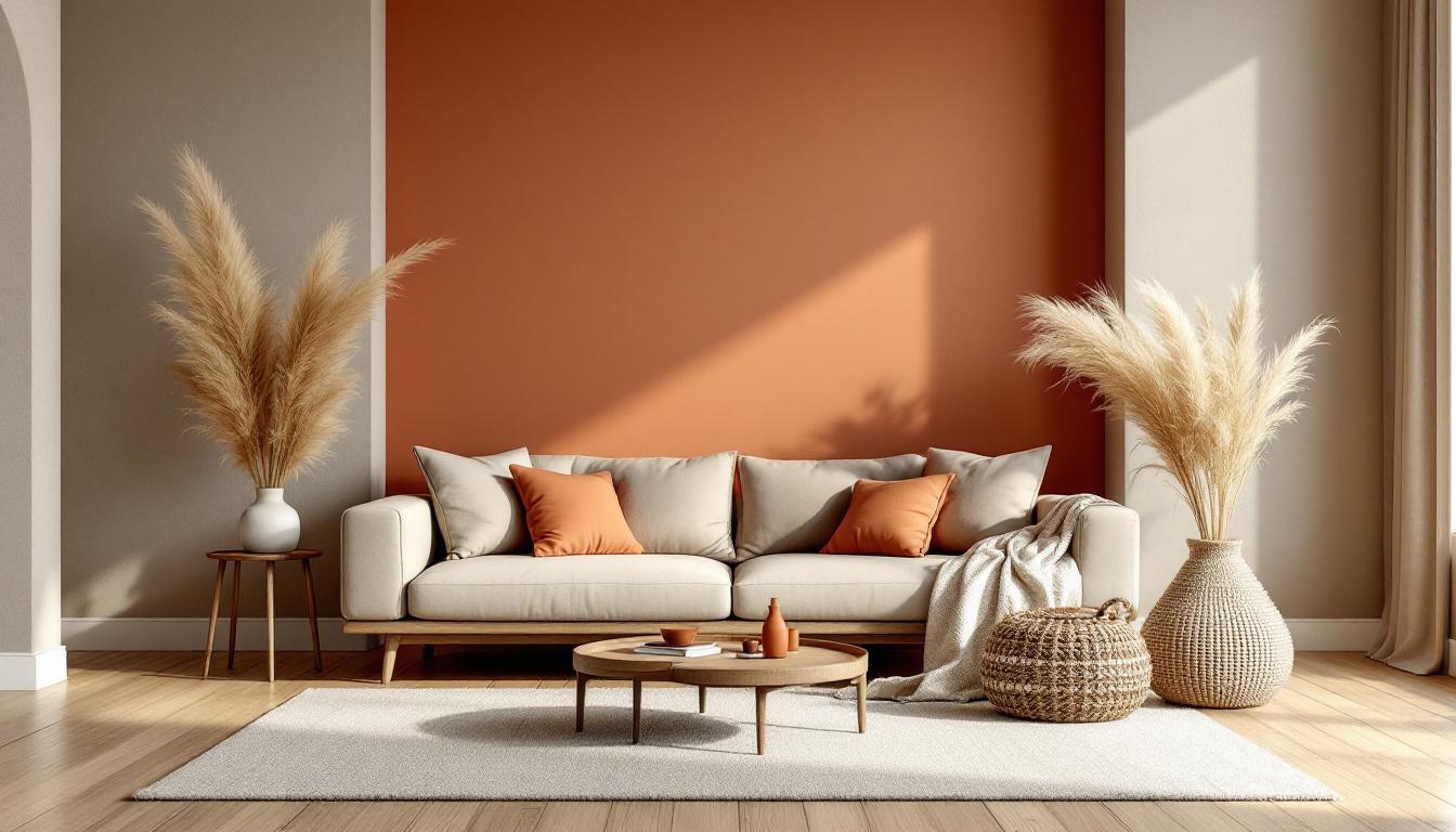
IN for 2026: Warm whites like Benjamin Moore White Dove and Sherwin-Williams Alabaster. Earthy greens — sage, olive, and forest green are the biggest trend of the year. Warm neutrals: greige, warm taupe, mushroom. Rich browns including chocolate, espresso, and caramel. Terracotta and clay tones that bring warmth without being loud. For the bold: deep navy, moody plum, and smoky jade.
Pantone, Benjamin Moore, and Sherwin-Williams all landed in similar territory for their 2026 color of the year picks — warm, grounded, nature-adjacent. The trend is unified: we're moving away from cool minimalism toward warm livability.

Warm Neutrals That Never Go Wrong
If you're not sure, go warm neutral. These colors work with almost any furniture, age well, and photograph beautifully — which matters if you ever list the home.
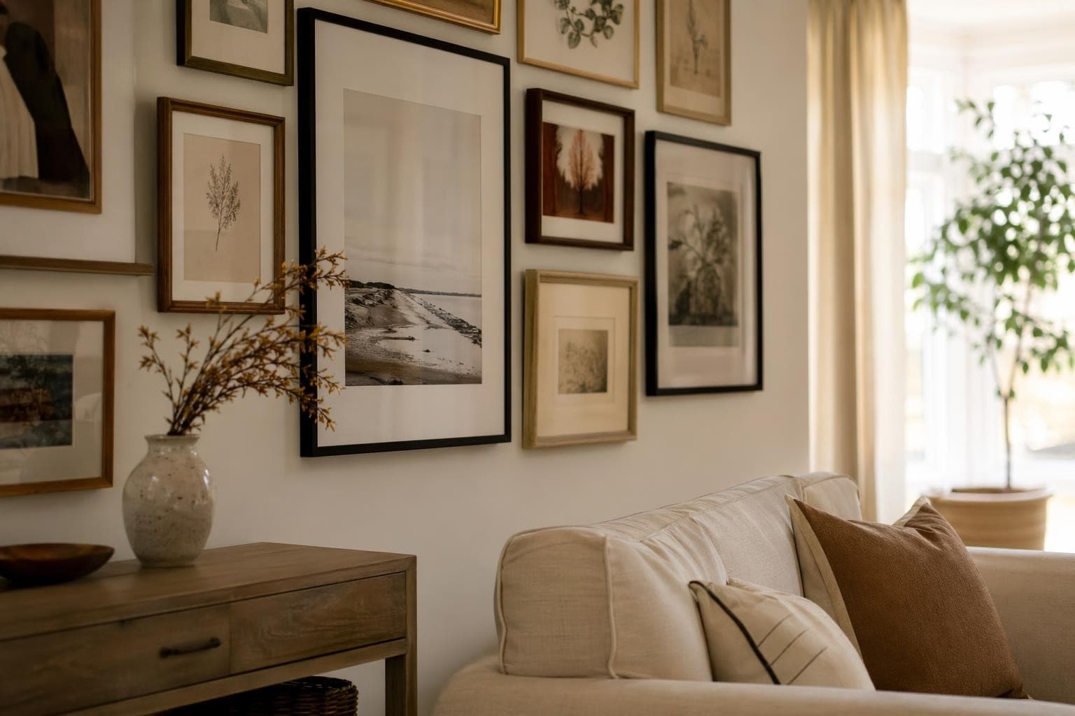
Greige (gray + beige) is the most forgiving color on the planet. It reads warm in warm light, cool in cool light, and pairs with wood, metal, fabric, and every furniture color from black to white. Warm white is not boring if you layer textures — linen curtains, a jute rug, wood shelving. Camel and caramel tones are surprisingly versatile and look expensive. Mushroom is sophisticated and works in both north- and south-facing rooms where other colors would fight the light.
Best for: resale, open floor plans, rooms with lots of art or furniture you want to feature. Budget: $35–50 per gallon for premium brands like Benjamin Moore Regal or Sherwin-Williams Emerald. Test warm neutrals on your actual living room walls with StableRender — lighting changes everything, and what looks beige in the store can look pink or orange at home.

Bold Colors for Living Rooms That Can Handle It
Bold colors work. The mistake is not committing. Half-hearted bold is worse than no bold at all.
Deep navy pairs with brass, warm wood, and white trim — it's classic and feels expensive. Budget $40–60 per gallon for a quality navy; cheap navy looks flat. Forest green is 2026's defining color. It's grounding, natural, and works with everything from mid-century modern to farmhouse. Terracotta is warm and energizing — it works with both modern and traditional furniture and ages beautifully. Moody plum is dramatic but works in rooms with good natural light. Black walls are real and they work, but only with warm lighting (3000K bulbs minimum) and a white or very light ceiling.
How to commit without regret: paint one accent wall first and live with it for two weeks across different times of day and different lighting conditions. If it still feels right, do the rest. The 60-30-10 rule helps: 60% dominant wall color, 30% furniture and textiles, 10% accents. Bold walls need quieter furniture — if your sofa is already a statement piece, the walls need to step back.
Paint Finishes That Matter More Than Color
Most people obsess over color and pick the wrong finish. The finish affects how a color looks on the wall just as much as the color itself — and it determines how long the paint job lasts.
Flat or matte hides wall imperfections best and gives rich color depth, but it's harder to clean — best for low-traffic living room walls that don't take abuse. Eggshell has a slight sheen, is the most popular finish for living rooms, and can be wiped down without destroying the paint. It's the right default choice for most people. Satin is more washable and slightly shinier — good for families with kids or pets who touch walls constantly. Semi-gloss belongs on trim and moldings only. It shows every imperfection on a flat wall but looks sharp on architectural details. Limewash is the trending texture finish of 2026 — organic, layered look, $50–80 per gallon, and it's actually easier to apply than it looks. Key rule: higher sheen equals more durable but shows every wall imperfection. If your walls aren't smooth, go flatter.

Living Room Paint Ideas by Lighting Direction
The direction your living room faces is the single most important factor in how paint color looks — more important than the color itself. The same paint can look completely different in two rooms.
North-facing rooms get cool, flat light all day — go warm to compensate. Creamy whites, warm greens, terracotta, and camel tones all work. Avoid cool grays and blues — they'll feel depressing. South-facing rooms get warm, bright light and can handle almost anything. Even cool blues work in a south-facing room because the warm light balances them. East-facing rooms get bright morning sun and dim afternoon — soft greens and warm neutrals look best throughout the day. West-facing rooms get dark mornings and intense afternoon sun. Be careful with yellows (the warm afternoon light pushes them orange). Blues work well here.
The proper paint sample test: paint a 2x2 foot swatch on two different walls and observe it at morning, noon, and evening light. Don't look at a swatch on a white card. Better yet, upload your living room photo to StableRender and see the color on all four walls instantly — it's a significantly better test than a 2-inch paint chip and takes 30 seconds instead of waiting for paint to dry.

Paint Color Combos That Work Together
Proven combinations that work without needing a designer:
White trim + sage walls + warm wood furniture — the most popular combination of 2026, works in virtually any room. Navy walls + white trim + brass accents — timeless and elegant, feels expensive at any budget. Warm white walls + terracotta accent wall + linen textiles — adds warmth and dimension without commitment to full bold color. Color drenching (all-one-color): walls, trim, and ceiling in the same tone or very close shades — a high-end look that makes small rooms feel intentional rather than cramped. Two-tone walls: darker on the bottom half, lighter on the top, divided at chair rail height (32–36 inches from the floor) — works especially well in older homes with architectural character.
Frequently Asked Questions
What is the best living room paint color for 2026?
Warm whites and earthy greens are leading in 2026. Benjamin Moore White Dove and Sherwin-Williams Alabaster are the top warm whites. For green, sage and forest green are dominating. If you want the safest bet that works in any room regardless of lighting or furniture — go warm neutral: greige, warm taupe, or mushroom. These won't date quickly and work for resale.
How many coats of paint for a living room?
Two coats minimum for any paint job. Three coats if you're going bold over a light color, covering a dark color with something lighter, or switching from a warm to cool tone. Always use a tinted primer when making a dramatic color change — it reduces the number of topcoats needed and improves color accuracy. Skipping primer is the most common mistake and it shows.
Can I preview paint colors on my walls with AI?
Yes. StableRender lets you upload a photo of your living room and test any paint color or design direction on the actual room. It takes about 30 seconds and you get 3 free renders to start. It's dramatically more accurate than paint chips or digital swatches because you're seeing the color in your actual room with your actual lighting and furniture — not a generic sample room.
Should I paint my living room walls all one color?
Usually yes for small and medium rooms — one color makes the space feel larger and more cohesive. For larger living rooms (over 300 square feet), an accent wall on the focal wall (behind the TV, sofa, or fireplace) adds dimension without making the room feel smaller. Avoid accent walls that are a completely different color family — contrast works better when it's a deeper shade of the same hue.
What paint finish is best for living rooms?
Eggshell is the right answer for most living rooms. It has just enough sheen to be washable, not so much that it shows every wall imperfection, and it holds color depth well. Go satin if you have kids or pets who regularly contact the walls. Use flat or matte only if your walls are rough or textured and you want to hide the imperfections — it's harder to clean but gives the richest color.